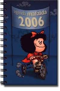
I spent a while getting my blog's look how I wanted it, and I'm satisfied ^_^ Another thing I ¿wasted? ¿invested? time on today, that was related to aesthetics, was making the cover of my new organizer more appealing. It used to look like this:

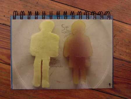
Now it looks like this:
 "Se comen juntos - Pero por separado"
Queso y dulce, un "postre" que nunca probé porque anticipo que sabe mal. That's a postcard from Terrorismo Gráfico. Es una revista postal. You get a box with some cool artwork that responds to a theme, and inside a bunch of themed postcards. The only bad part is the price: $15; I have access to these things because my almost-mother-in-law has a free subscription and I "borrow" it.
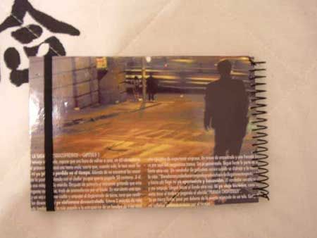
Another thing I embellished with a postcard was a notepad. Poor thing, it was a pretty ugly little notepad, so I decided to make it look like this:

That's another TG postcard, que contiene el capítulo 5 de La saga del esquizofrénico. It was nice to find a use for it, cause one of the things I like the most about TG are the postcards with pictures of Buenos Aires. I would've scanned the postcards I used instead of taking pictures of them, but my scanner is a bit fucked up, I ruined it trying to clean it (I didn't remember that acrylic is not the same as glass). I also added elastic that I glued to the back of the notepad, so that it won't fall open inside my bag and get all the pages wrinkled like it happened with the last one (idea I stole from a friend's organizer).
I'm quite happy with my organizer and notepad, definitely happier than I was before. Honestly, I wish it wasn't hard (expensive and excessively time consuming) to find things that already looked nice when I bought them, but this is not bad either.


0 comments:
Post a Comment